1 · User requirements & raw feedback
Safety managers needed faster access to scattered safety tools: incidents, observations, inspections, and hazards from one place on mobile.


I designed Safety Hub in Procore to help safety managers handle tools with less friction on site, on mobile, in seconds.
The project didn’t start with a Figma file. It started with user requirements and raw feedback from safety managers on active job sites. The PM translated that into structured requirements. My job was to turn those requirements into a design brief, and then into a mobile command center that made sense in the field.
Safety managers needed faster access to scattered safety tools: incidents, observations, inspections, and hazards from one place on mobile.
The PM consolidated feedback into product requirements: one command center, overview cards per safety module, and drill-through paths.
I translated requirements into a mobile design brief: information hierarchy, navigation depth, and what “done” looked like for Phase 1.
Exploration through iteration to a validated command center with flows into every safety module.
Safety managers arriving on site at 7 AM had to piecemeal their data together before walking the floor. Incidents, observations, inspections, and toolbox talks were split across four separate app areas. The product offered no central view to triage open items, spot trends, or flag repeat offenders.
Compounding the problem, the interface relied on dense desktop dashboards that failed in the field: direct sunlight, gloves, and thirty seconds to spare. The data views were not built for those conditions.
Centralize safety in Safety Hub. Build a single qualifications grammar for mobile and web.
Products shipped to beta in 2026. Feedback shaped what went live.
I owned the translation layer between requirements and design across both phases: writing the brief, designing the command center, planning the study, running synthesis, and delivering cross-platform dashboard cards.
Phase 1: PM requirements became the mobile design brief. Phase 2: a separate requirements doc for five dashboard cards became a research-backed design process.
Phase 2 end-to-end: UserTesting study, prototypes, sessions, and synthesis into a guess-free redesign.
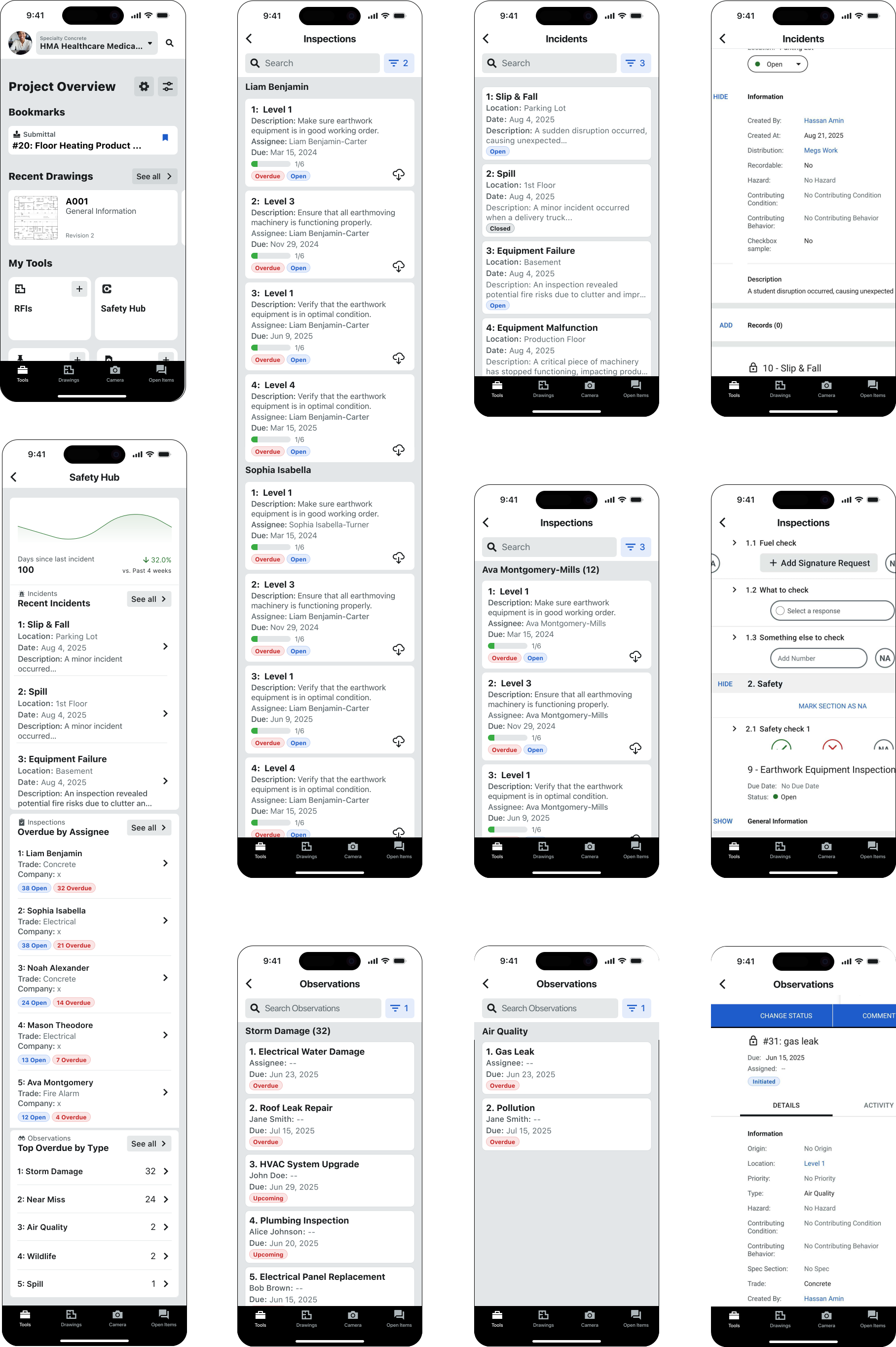
Phase 1 mobile design: command center architecture, overview cards, drill-down flows. Every screen answered status, trend, and next action at a glance.
Phase 2 extended to web and mobile in parallel. Same data, different density and layout decisions for each surface.
I tested how to surface safety features as scannable list items, emergency contacts, and module entry points: what managers expected when they opened the app.
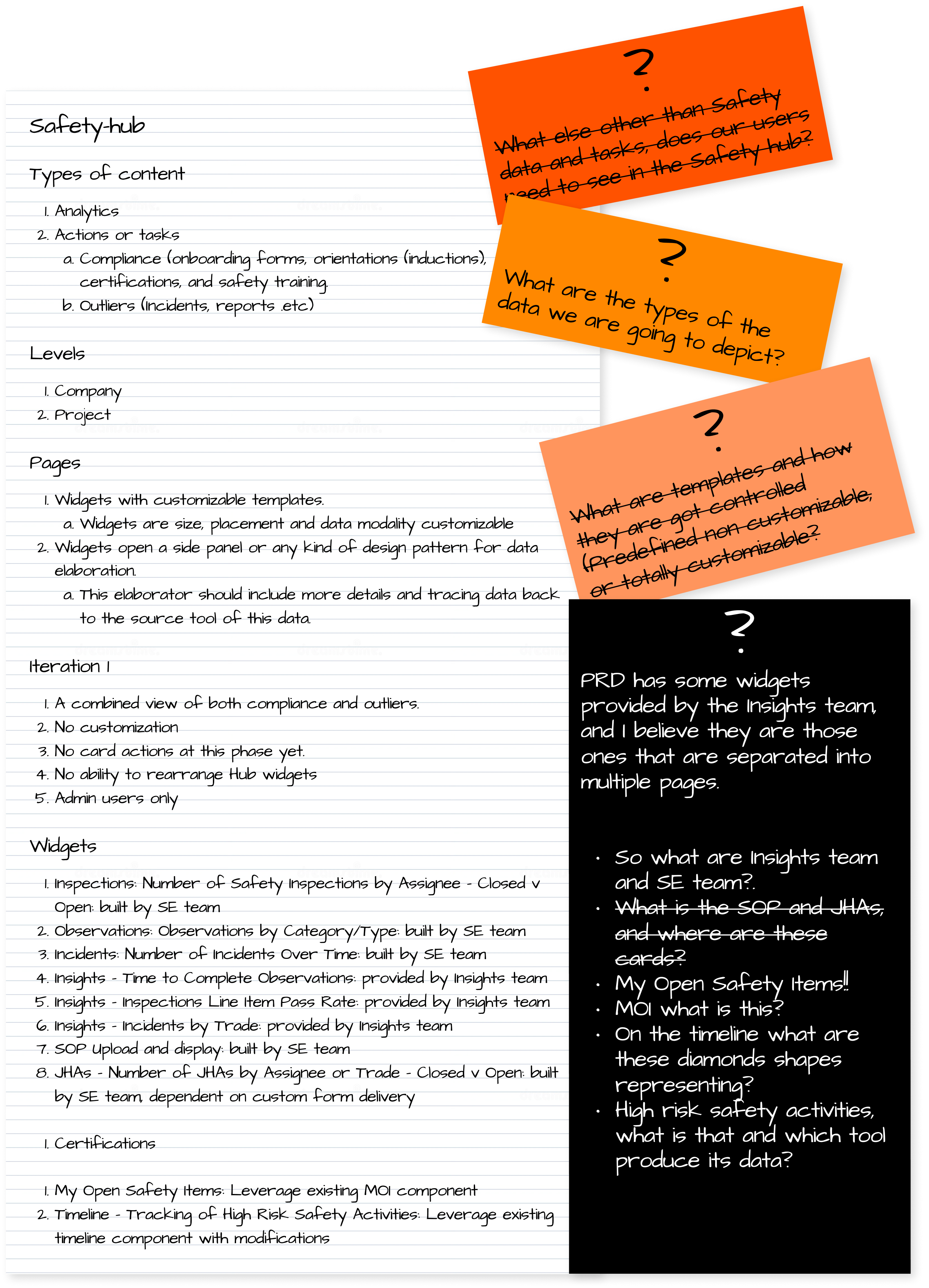
I explored how to layer data onto the command center: safety score trends, open incident counts, critical items, and equipment status.
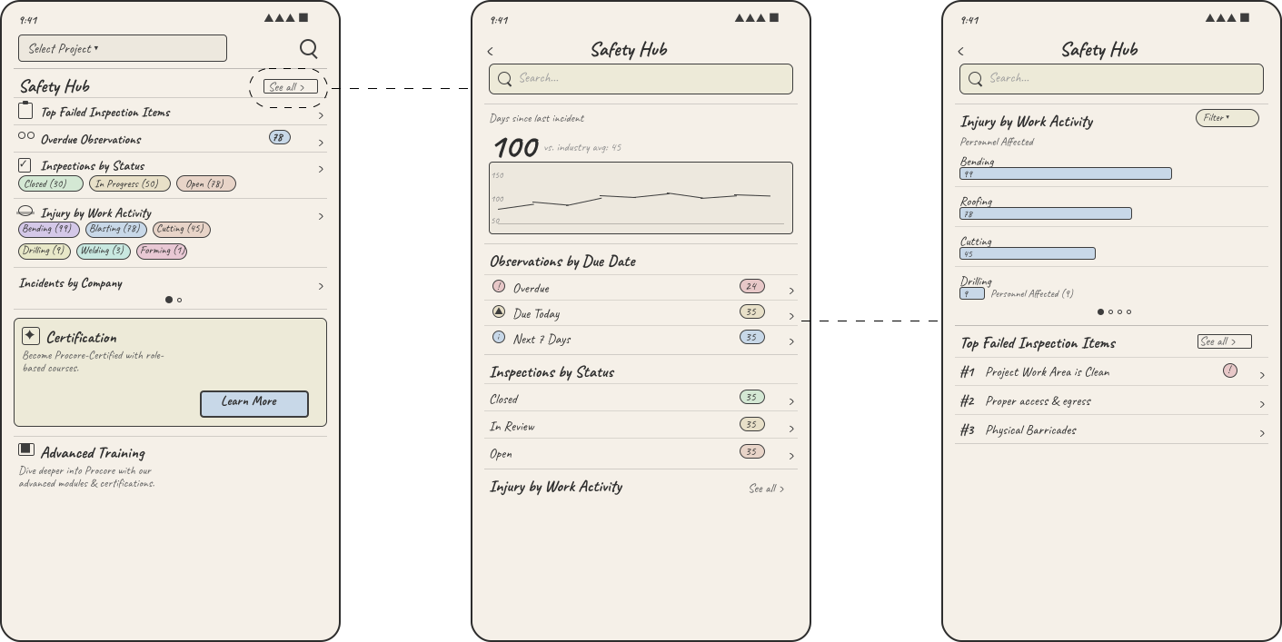
The same three-tap path into every safety module: status at the top, next action at the bottom.
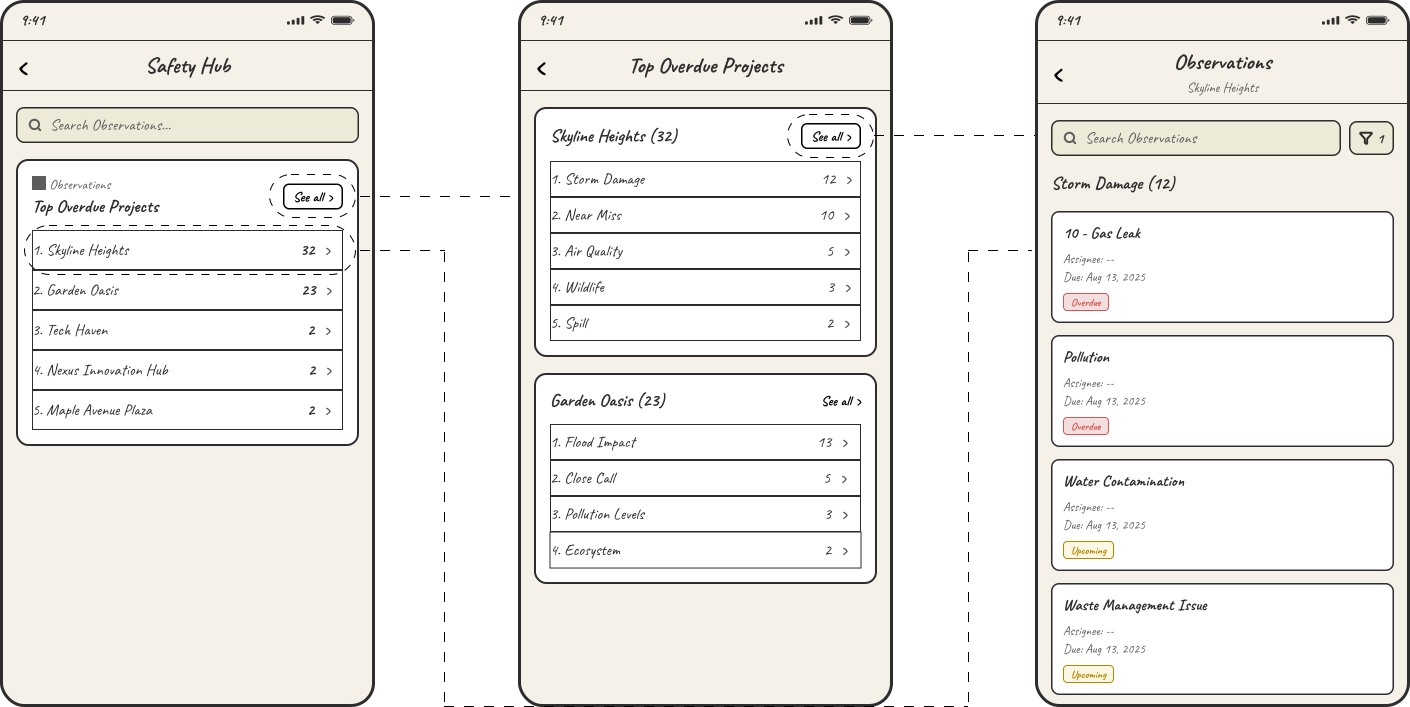
Phase 2 started with requirements for five dashboard cards. Requirements became a UserTesting study, first iteration, synthesis, and a guess-free redesign for web and mobile.
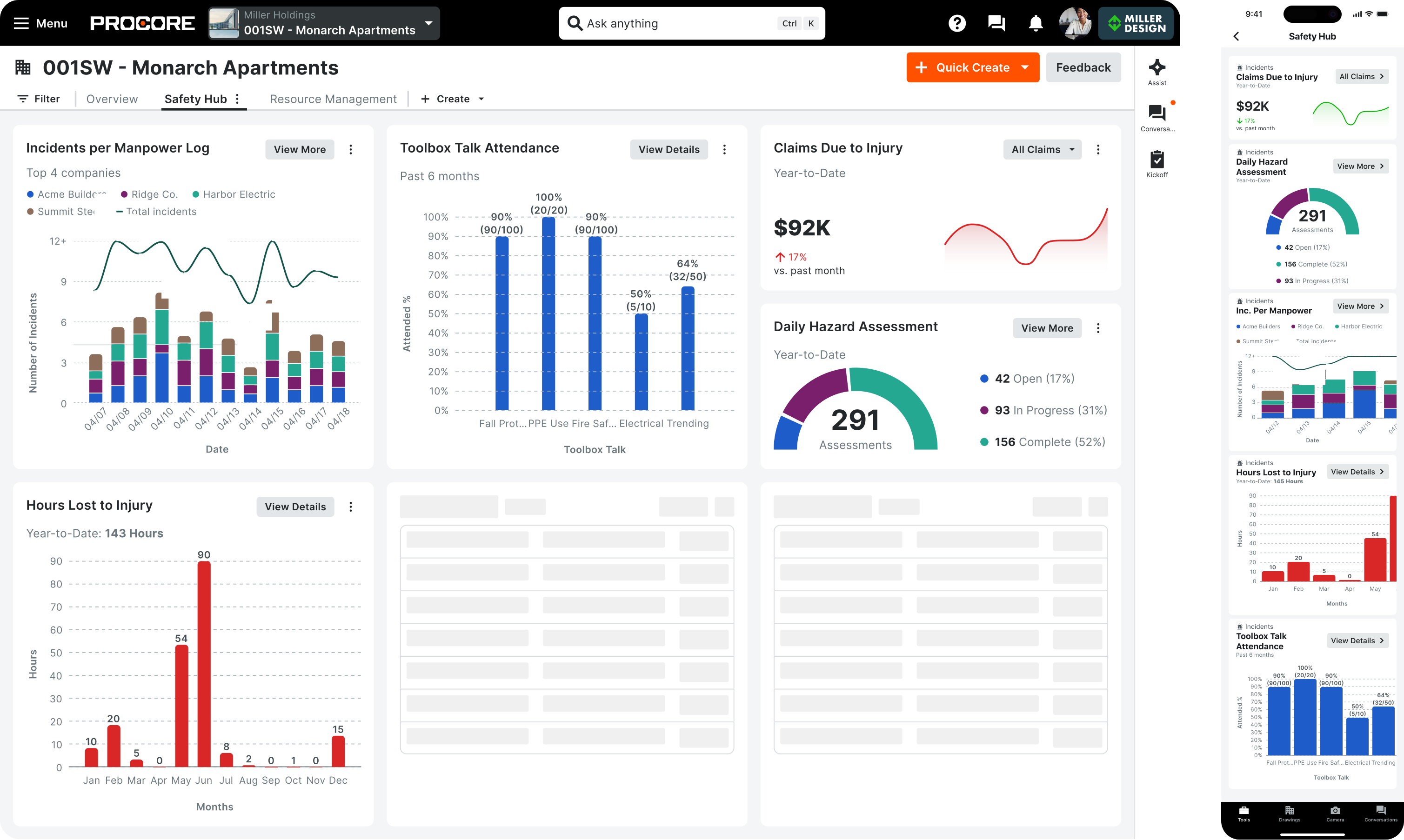
Five dashboard cards covering claims, hazards, incidents, hours lost, and attendance.
Unmoderated UserTesting study with tasks, success criteria, and comprehension questions per card.
Initial card set from requirements, built as study prototypes.
Sessions with construction professionals; findings organized by failure pattern.
All five cards redesigned so users didn’t have to infer, calculate, or guess.
One question per card: can a construction safety manager understand what this is showing, and what to do next, without guessing? Findings were organized into three failure modes, not by card, but by comprehension breakdown type.
construction professionals in unmoderated UserTesting study
hours of recorded sessions, later synthesized with AI
cards redesigned after synthesis before development handoff
platforms delivered: web and mobile in parallel
Hours lost should be a number, not a calculation.
“I’d expect lost hours or days due to incidents, not projected vs. actual work.”
Status without context is just noise.
If the title doesn’t say injury, users read billing.
“This looks like it’s tracking money. Is this contractor payments?”
Safety Hub works at two scales. At company level, managers triage safety across every active project. At project level, they drill into one job site and act on observations, incidents, inspections, and hazards without leaving the hub.
The portfolio command center surfaces safety scores, overdue projects, and module entry points across the company. Managers see what needs attention before they pick a project.
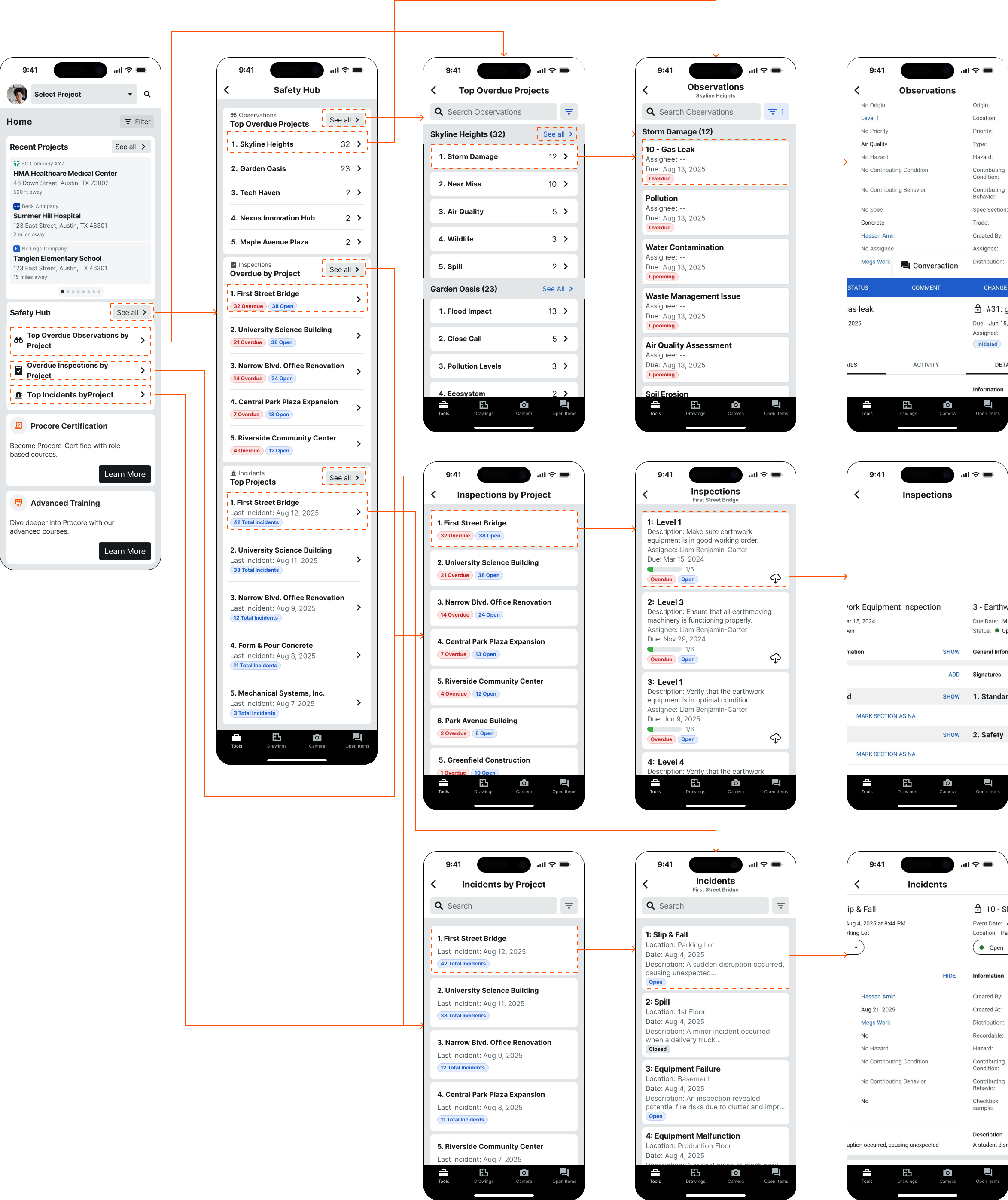
Inside a single project, the same command center grammar narrows to that site: safety score, open items, and one-tap paths into each safety module.
Guess-free dashboard cards at company level on web and mobile, redesigned after synthesis.
This was a year of design leadership on a complex enterprise product. It was research-heavy, cross-platform, and multi-phase. The work was shaped by real user behavior.
Phase 1 started with user feedback and PM requirements. I turned those into a design brief and a mobile command center. In Phase 2, I took a new requirements doc, built a research plan, tested the first iteration, and redesigned based on synthesis. I owned the translation from requirements to design decisions in both phases.
In Phase 2, I planned the study, set up UserTesting, built first-iteration prototypes, ran unmoderated sessions, and wrote the synthesis doc. I organized findings by failure mode, not by card. That turned a list of problems into a redesign brief with clear principles.
Phase 1 was mobile-only. Phase 2 delivered the same five dashboard cards on web and mobile at the same time. The data grammar was the same, but the density and layout were different for each surface. I treated them as two separate design problems.
The Phase 1 command center architecture (category overview, process drill-down, report detail) informed how I structured the Phase 2 cards. I kept status at the top and action at the bottom. That hierarchy carried from mobile navigation into dashboard data visualization on both platforms.
Phase 1 worked because I translated PM requirements into a design brief first. I defined hierarchy, card grammar, and navigation depth before any screens existed. That brief became the reference point for every iteration decision.
Phase 2 could have gone straight to final designs. Instead, I built a UserTesting study first. Testing before committing caught comprehension failures in four of five cards that looked fine on paper.
I organized findings by failure mode (math, misread labels, mismatched titles) instead of by card. That turned a research report into a redesign brief. How you organize what you learned determines what people can act on.
The guess-free redesign was a comprehension standard. Every card had to pass one test: can a manager understand this in 10 seconds without inferring anything? I applied that principle to both web and mobile, even though the layouts were different.