Scheduling fragmentation
Professionals manually synced multiple calendars, chased confirmations, and blocked availability by hand, work that had nothing to do with their actual craft.
Case study · Super App
I led design for Meridian, covering calendar organization, smart booking, and a modular public profile builder for independent professionals across web, tablet, and mobile.
Independent professionals in creative, lifestyle, and healthcare industries were running a business and doing the work simultaneously, across fragmented tools with no unified workflow.
“I don’t need another app. I need the apps I already use to talk to each other, and I need my clients to find me without explaining what I do every single time.”
Professionals manually synced multiple calendars, chased confirmations, and blocked availability by hand, work that had nothing to do with their actual craft.
Clients had no unified path from discovery to booking: no single place to understand services, view live availability, and confirm.
A static link-in-bio page couldn’t carry the full weight of a professional’s identity, services, or real-time availability.
A single intelligent platform consolidating scheduling, booking, client management, and personal branding, with a design system first, then high-velocity validated output.
Increase in stakeholder satisfaction from Design Lead transition
Screens across desktop, mobile & tablet
Components in the shared design system
Fewer design ↔ engineering back-and-forths
Stakeholder interviews, three professional archetypes (Creative, Healthcare, Lifestyle), and journey maps for both professional and client paths.
Token-based library before feature work: cards, modals, forms, empty states, and cross-platform variants that multiplied team velocity.
Weekly critiques, stakeholder validation gates before handoff, and clear feature ownership so three designers could work in parallel.
Six major feature areas, each designed for a distinct mental model, validated with stakeholders, and built from the shared component library.
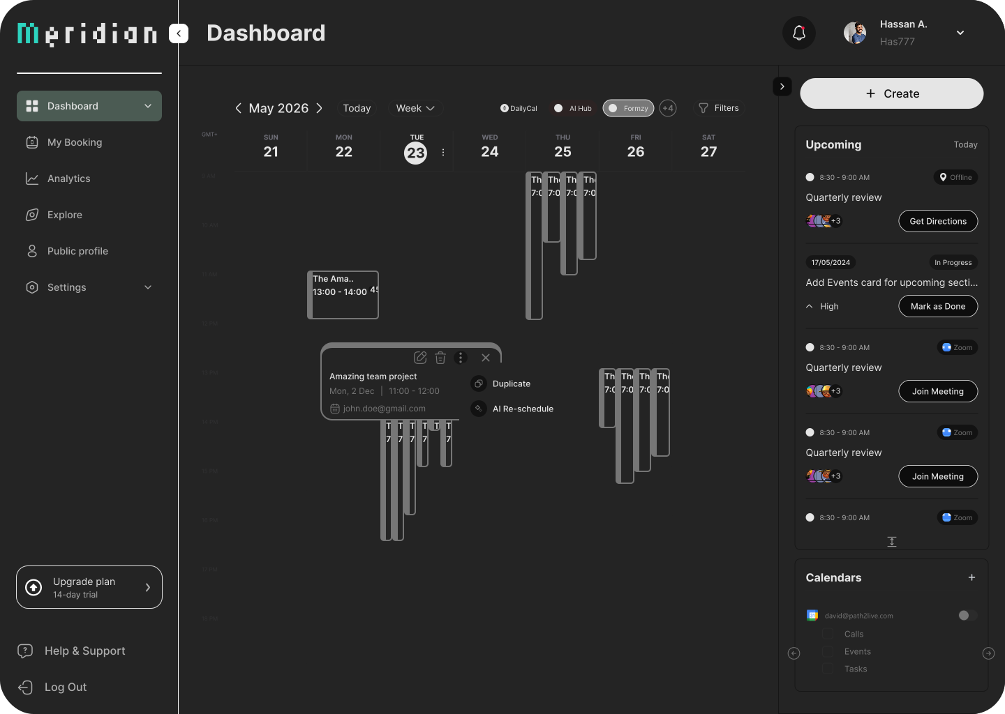
Three schedule views with a persistent toggle: Calendar, Board/Gantt, and Table, so professionals could inhabit their work the way they actually think.
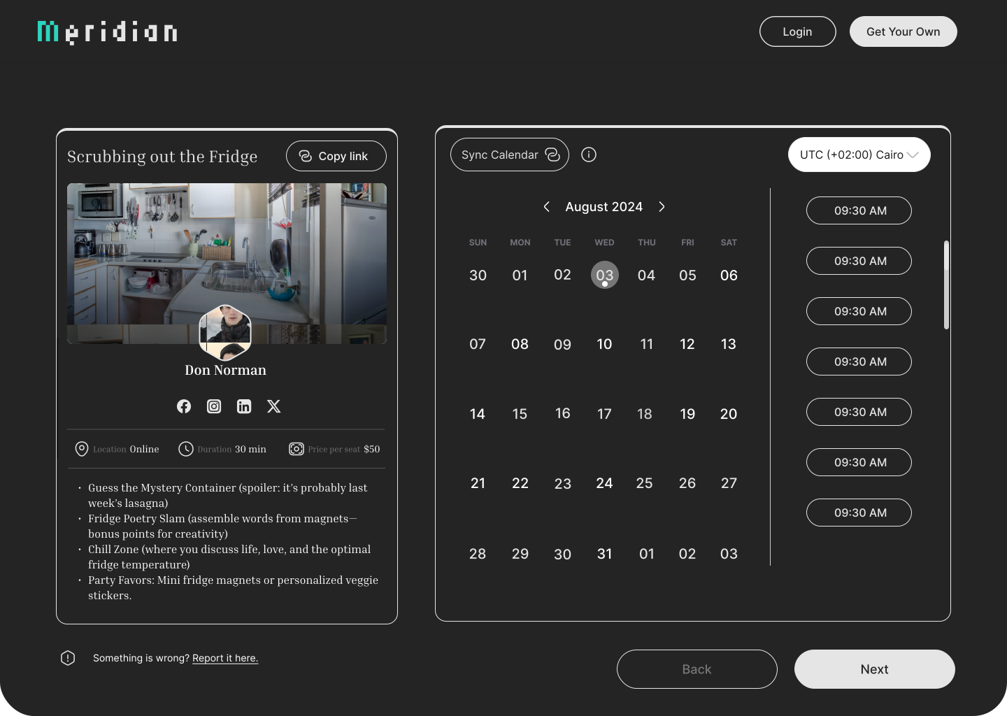
Two-panel layout: identity and social proof on the left; live calendar picker on the right.
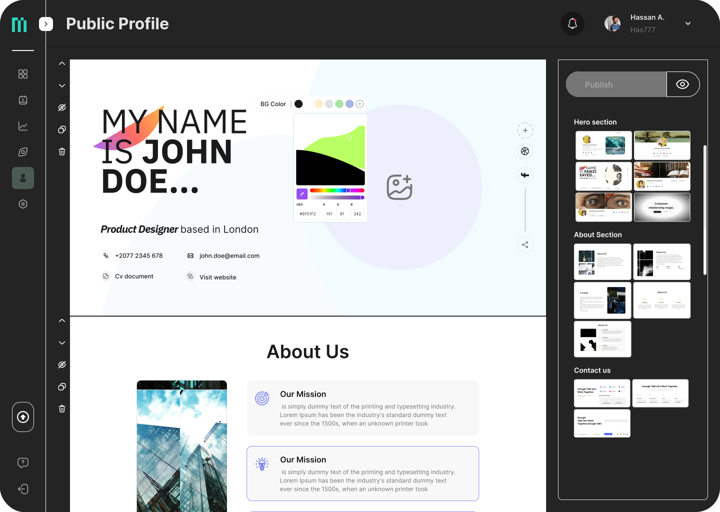
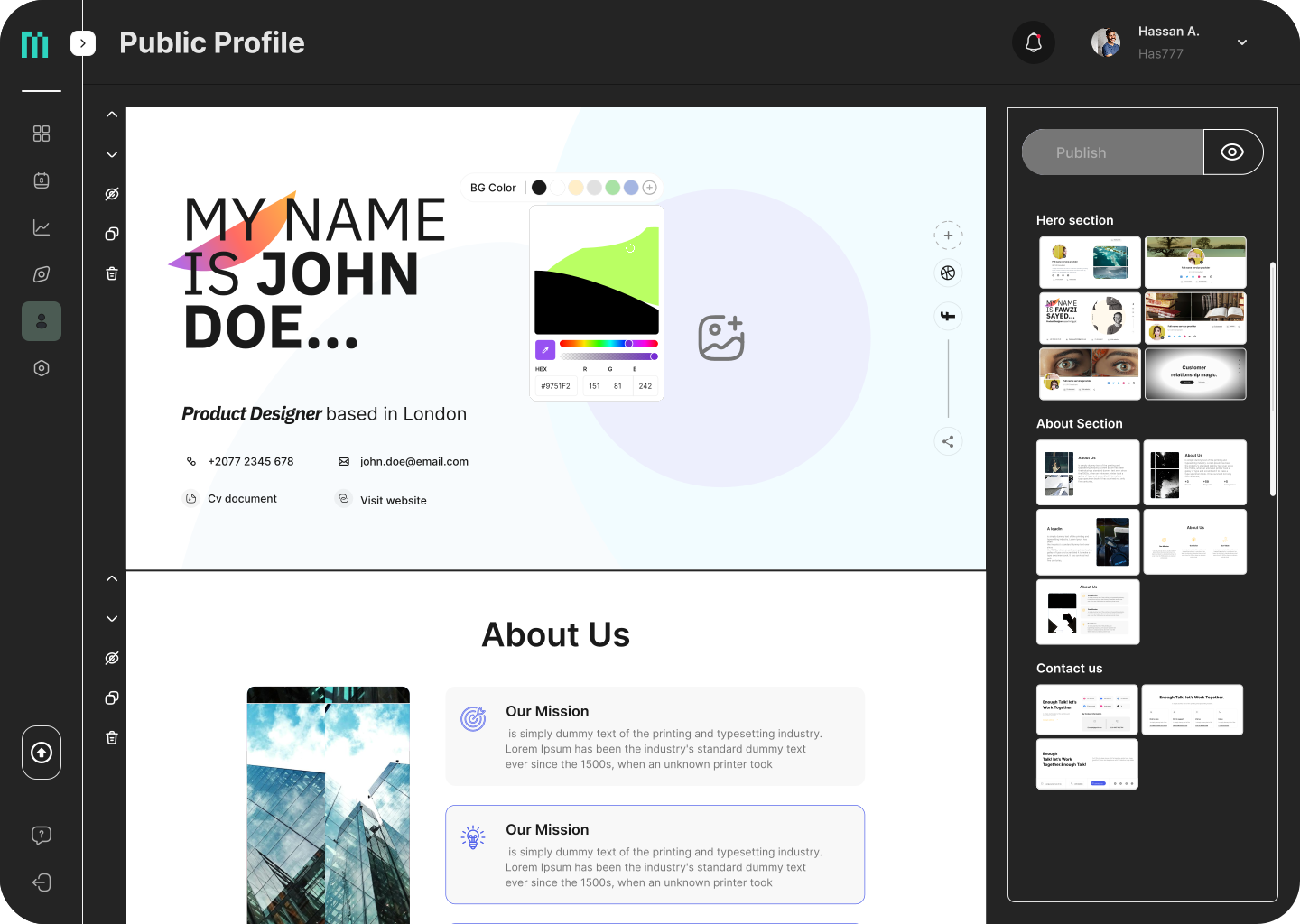
Modular drag-and-drop sections: hero, services, gallery, testimonials, available times.
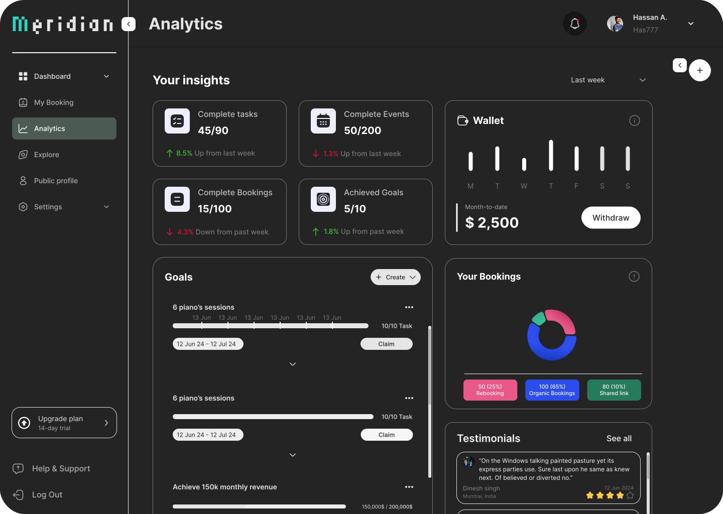
Summary, trend, and granular breakdown views, with every metric mapped to a stakeholder question.
Organized settings architecture and an upgrade modal designed to reduce anxiety at checkout.
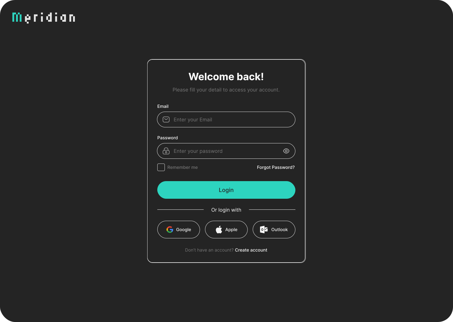
Focused login with email/password, recovery path, and SSO via Google, Apple, and Outlook, treated as a brand moment, not a gate.
Across 12 months and six major feature areas, the work delivered at both the product and team level. The product was discontinued by executive decision before reaching live production. The work here reflects the full design lifecycle during the active phase.
+80% satisfaction measured from the Design Lead transition, a direct signal of improved design quality, process rigor, and cross-functional alignment.
20 screens per sprint vs. 6 prior, a 3× increase driven by the mature design system and clearer handoff protocol.
Web, tablet, and mobile from a single token-based system with platform-specific component variants.
Where fragmented patterns existed, one design system emerged, enabling three designers to work in parallel without divergence.
The upfront cost felt like a slowdown in months one and two. By month four, it was the single biggest multiplier on team velocity and output quality.
Structured, frequent reviews tied to specific decision questions turned stakeholder sessions into a velocity tool, not a bottleneck.
Clear feature ownership created accountability and deep expertise, dramatically improving handoff quality by project end.
The invisible output, shared language, validated process, and confidence to push back, is the work I’m most proud of on this project.