Dual mandate
Support patients on hard days while collecting anonymized signal for researchers. Neither audience could be an afterthought.
Case study · Healthcare · Novartis
Articles, reminders, and healthcare provider listings for patients and caregivers, with secure feedback collection for analytics and clinical studies.
The goal was clear: build a hybrid app with articles, reminders, and provider listings while gathering user feedback for analytics and clinical research. Translating high-level requirements into actionable specs meant every design decision had to serve both usability and security, especially when handling sensitive medical data.
Support patients on hard days while collecting anonymized signal for researchers. Neither audience could be an afterthought.
A robust feature set had to coexist with a seamless experience and strict data protection for thousands of simultaneous users.
High-level stakeholder requirements needed to become detailed, build-ready flows without losing the human context behind each feature.
Empower users to manage appointments and medications without cognitive overload.
Provide accessible, trustworthy articles that enhance lifestyle and treatment understanding.
Enable efficient collection for clinical studies and analytics without compromising the daily experience.
Ensure the platform could scale securely with robust encryption and zero tolerance for data breaches.
Through stakeholder interviews, surveys, and contextual inquiry, two primary audiences emerged. Users demanded clear reminders, simple navigation, and data privacy as a non-negotiable requirement.
Stay informed about treatments and manage appointments without missing medication windows.
Often forgot medication times and struggled to find trustworthy information online.
Analyze patient data to identify trends for clinical trials and improve care pathways.
Needed anonymized, compliant data while meeting strict privacy regulations.
Tailor content and reminders to each user’s medical journey.
Provide clear, trustworthy information about clinical trials and healthcare providers.
Ensure robust data encryption and privacy controls at every touchpoint.
Simplify sign-up, reminder setup, and article browsing into obvious workflows.
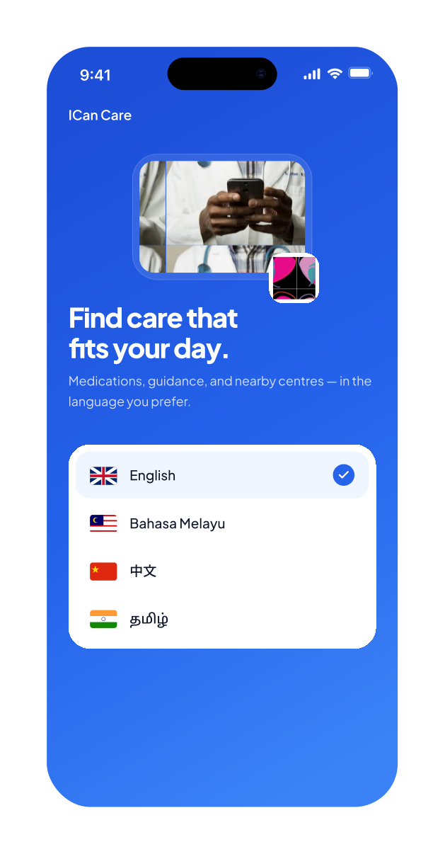
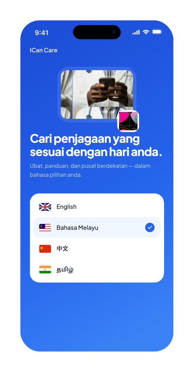
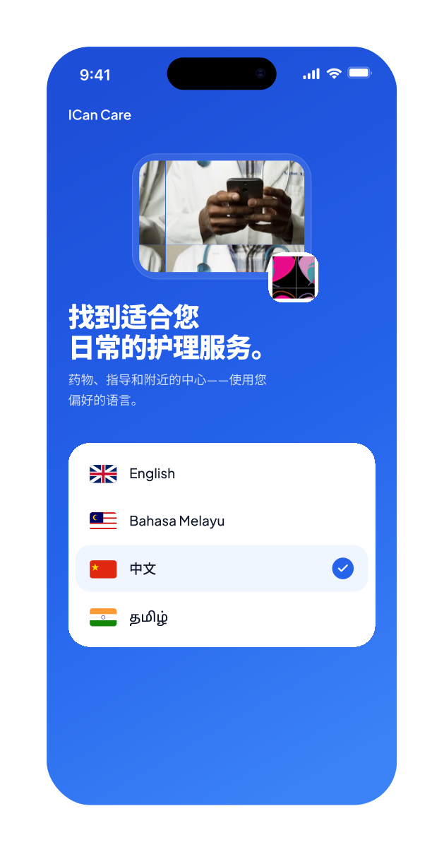
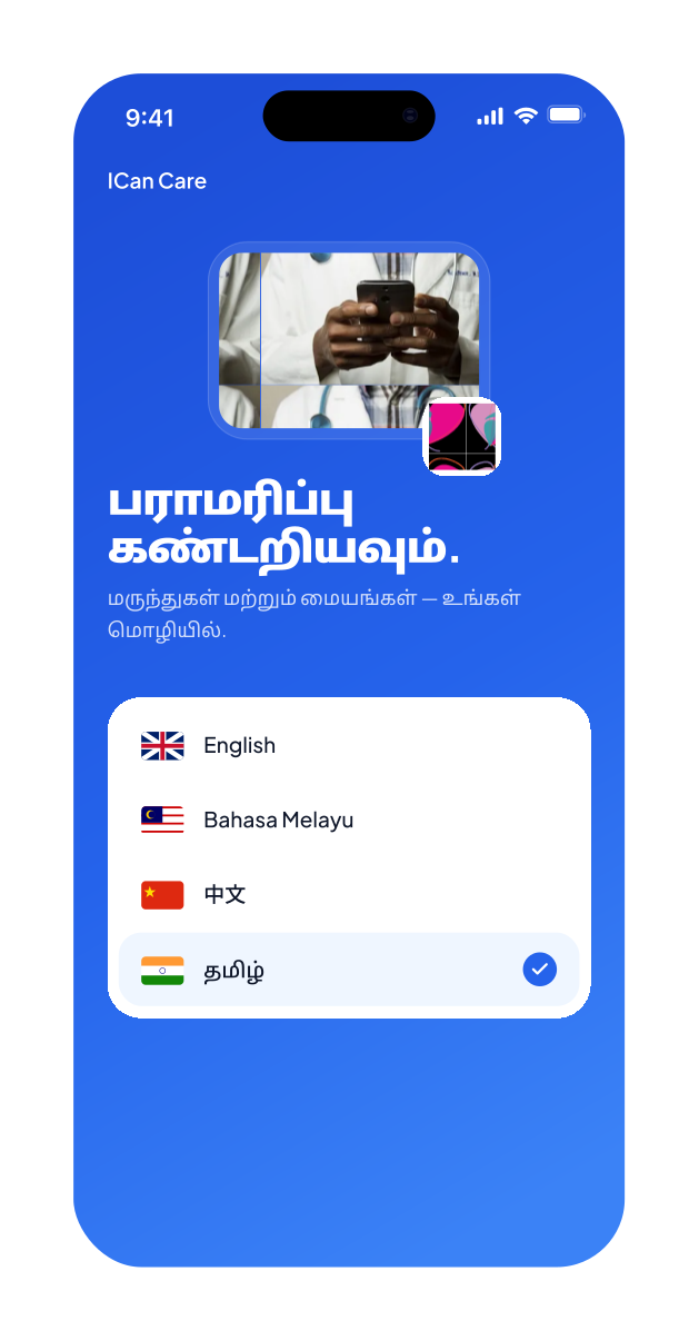
The home screen offered quick access to reminders, articles, and providers. Clinical trials and settings lived in separate sections so the daily care loop stayed focused. A later 2026 refresh refined this into five tabs with language-first onboarding for Malaysia (EN, BM, 中文, தமிழ்).
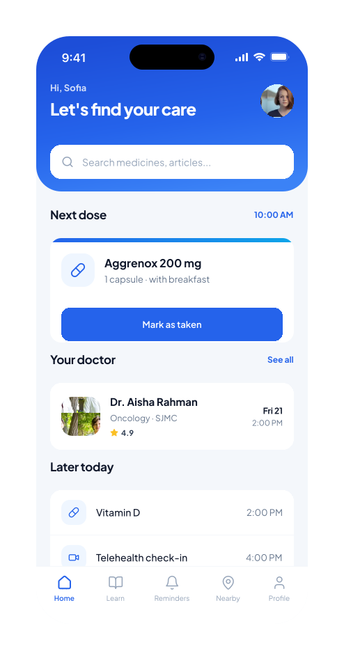
Greeting, search, next dose, doctor visit, and later today. The hub for the next action.
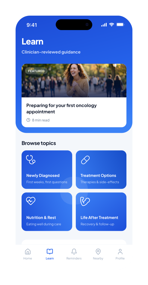
Clinician-reviewed topics and featured articles, filterable by therapeutic area.
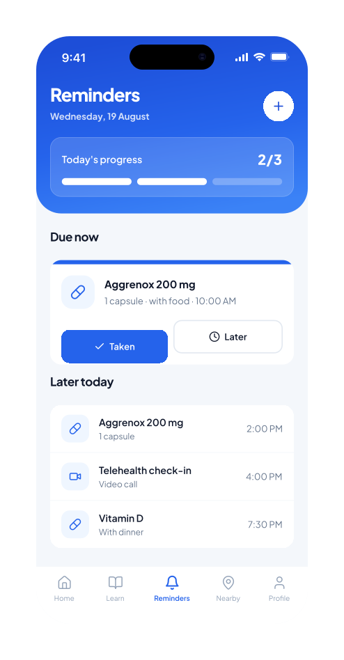
Progress for today, due-now decisions, and calendar-synced appointment schedules.
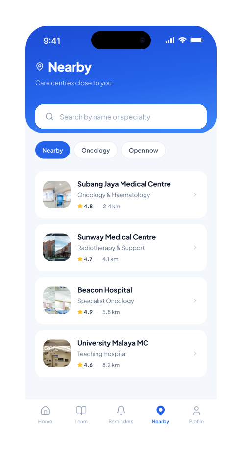
Healthcare provider listings by distance, specialty, and rating.
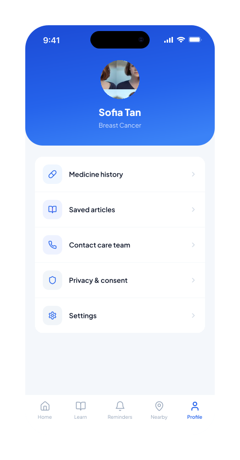
History, saved articles, care-team contact, privacy, clinical trials, and settings.
Register via email or social accounts with privacy expectations framed as care, not legal theatre.
Appointments and medication schedules synced seamlessly with phone calendars.
Filter articles by therapeutic area with featured stories and topic grids for scanning.
From mid-fidelity sketches to interactive high-fidelity prototypes, each iteration addressed user pain points. Core flows across onboarding, daily care, education, and trust.
English, Bahasa Melayu, 中文, and தமிழ் as equal choices. Continue opens Home, not a wall of forms.
Quick access to reminders, articles, and providers. Mark as taken is the primary action. Surveys never compete with urgency.
Today’s progress as a simple strip. Due-now cards offer Taken and Later, synced with phone calendars.
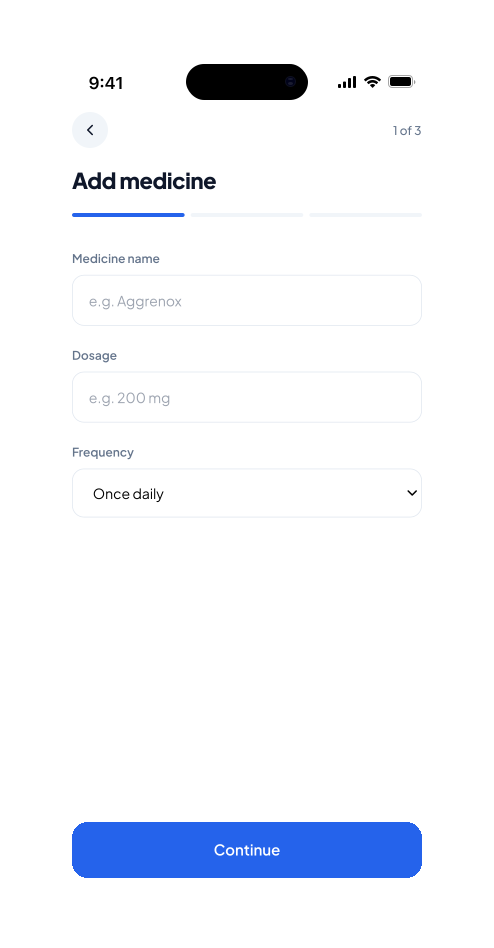
Name. Dose. Frequency. Confirm. A linear three-step flow so people leave with a saved medicine, not a half-filled form.
Featured article first, topic tiles second. Filter by therapeutic area for carers and common questions.
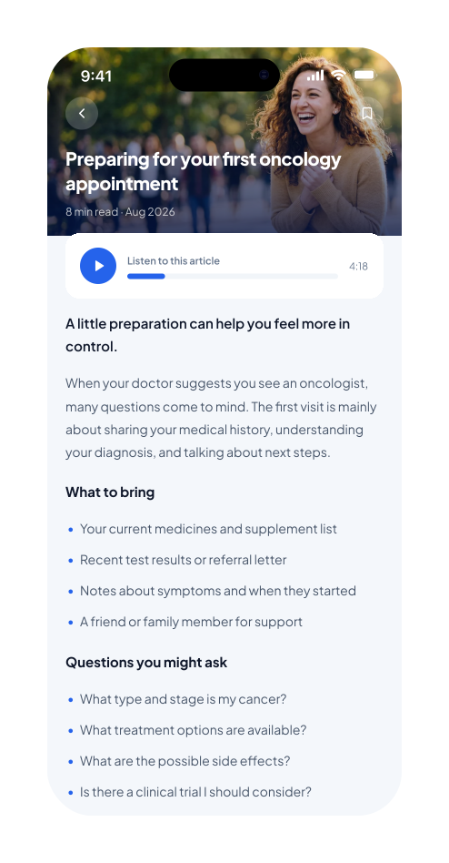
Hero image, save, audio progress strip, and checklist sections. Empathy without pretending the app is a clinician.
Search plus filter chips. Each row shows rating, distance, department, and a hospital photo.
Medicine history, saved articles, care-team contact, privacy & consent, and settings in one quiet place.
Prototypes were tested on both Android and iOS across three rounds of usability testing, plus a heuristic evaluation for error prevention, aesthetics, and efficiency.
Early builds buried key features. Information architecture was refined until reminders, articles, and providers were one tap away.
Mobile responsiveness and the medicine setup flow were optimized until the daily loop felt obvious.
Final testing confirmed the design’s effectiveness. Remaining gaps were small and documented for engineering.
Increase in time spent on the app after launch
Users successfully managed their appointment schedules
Rise in usable data reported by researchers for clinical studies
Reported data breaches with robust encryption in place
“The app makes it so easy to track my appointments and medications. The articles are also very informative and accessible.”
This project reinforced that thoughtful design can transform lives, especially when balancing technical constraints with human needs on hard days.
Stakeholder interviews and iterative testing caught navigation and setup issues before they reached production.
For medical data, consent and encryption change what you ask, when you ask, and how you store the answer.
Hannah lives on Home and Reminders. Dr. Ravi lives on optional research paths. Mixing those speeds on one screen helps neither.
Balancing a robust feature set with a seamless experience was challenging but rewarding. Whitespace and honest copy are not decoration.