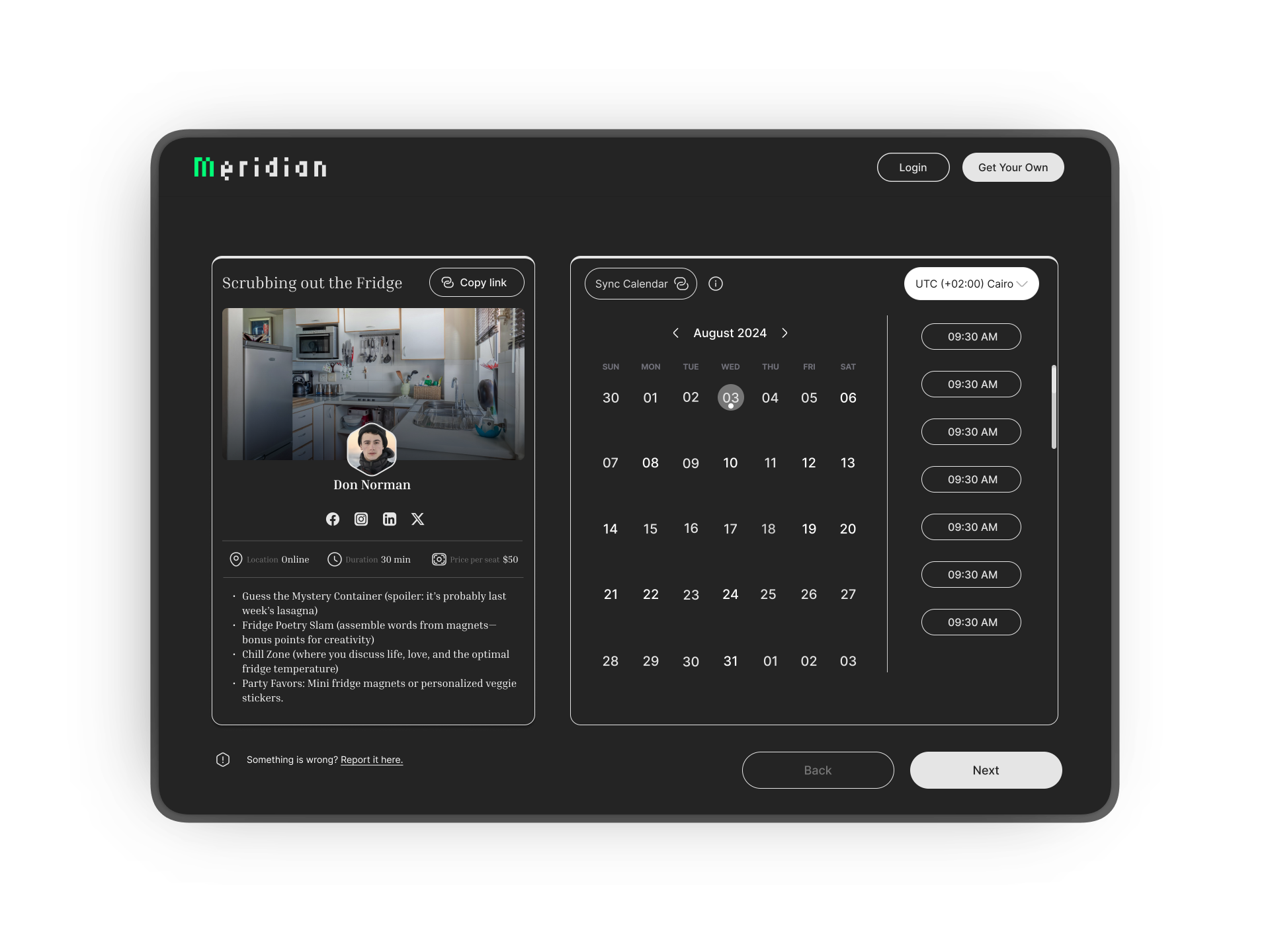
From scheduling chaos to a single intelligent system — how we redesigned the way independent professionals manage time, clients, and their professional identity.
Independent professionals in creative, lifestyle, and healthcare industries were running a business and doing the work simultaneously — across too many fragmented tools with no unified workflow.
"I don't need another app. I need the apps I already use to talk to each other — and I need my clients to find me without me having to explain what I do every single time."— Primary research insight, stakeholder sessions
Professionals were manually syncing multiple calendars, chasing meeting confirmations, and blocking availability by hand — work that had nothing to do with their actual craft.
Clients had no unified, trust-building way to discover a professional, understand their services, view live availability, and confirm — all in one experience.
A static LinkedIn or link-in-bio page couldn't carry the full weight of a professional's identity, services, or real-time availability.
A single intelligent platform that consolidates scheduling, booking, client management, and personal branding — with clear metrics to validate every decision.
The most direct signal of the team's operational and output quality transformation, measured from the point of Design Lead transition.
| goal | metric | status |
|---|---|---|
| Team efficiency | +70% improvement post Design Lead transition | confirmed |
| Screen output | 500+ screens across desktop, mobile & tablet — 20 screens/sprint vs. 6 prior | confirmed |
| Design system | 100+ components · 200+ edge cases documented | confirmed |
| Stakeholder satisfaction | +80% overall satisfaction increase | confirmed |
| Design ↔ engineering | 50% reduction in back-and-forths via established workflow | confirmed |
Rather than jumping to solutions, we started by understanding the business and professional landscape through structured stakeholder sessions — the primary validation mechanism throughout the project.
One of the most consequential strategic decisions: halt feature work and invest in a shared component library before building any screen. This multiplied velocity for the remainder of the year.
A structured design operation allowed three designers to work in parallel across six major feature areas while maintaining output quality and stakeholder alignment throughout.
The core challenge: give professionals a way to see their schedule in the format that matched their mental model. Some think in time blocks. Others in project pipelines. Others need raw data fast.
Rather than defaulting everyone to a weekly calendar, we designed three distinct views with a persistent toggle: Calendar, Board/Gantt, and Table.
why it mattersA scheduling tool that forces a single view forces a single mental model. We gave professionals the ability to inhabit their work the way they actually think — without losing state between views.
The client-facing booking experience sat at the intersection of personal brand, live calendar availability, and client trust — the most complex design problem on the project.
We designed a two-panel layout: a persistent left panel with the professional's identity and social proof; and a dynamic right panel with a live calendar picker and time slots pulled from integrated calendars (Google, Zoom, Slack, Apple).
why it mattersThe biggest conversion killer in booking flows is doubt. The architecture directly addressed: "Is this person available? Is this the right service? What happens after I confirm?"
For most users, the public profile page was not just a booking link — it was their professional identity on the internet. We designed it to feel like theirs.
Fully modular, drag-and-drop section builder: hero, about, services, gallery, video, testimonials, available times, and company logos. Two distinct add-section paths — a guided step-by-step flow for new users, and a direct link-to-existing flow for power users.
why it mattersCognitive load in profile builders spikes when users fear breaking something. The modular, reversible architecture — with deliberate delete/hide distinctions — gave users psychological safety to experiment without anxiety.
The analytics feature was designed to answer one question professionals actually care about: "Is my business growing?" — not to present raw data for its own sake.
Three insight layers: a summary view (key metrics at a glance), a trend view (booking and engagement over time), and a granular breakdown by service, client, or time period.
why it mattersDashboards fail when they show designers' favorite charts instead of users' actual questions. Every metric displayed was mapped back to a specific question surfaced in stakeholder sessions.
Most designers treat settings as a utility. Users treat them as a trust signal. A well-organized settings architecture communicates: "This product is in control. Your data is safe."
Organized across: General, Integrations, Referrals & Promo, Languages & Location, FAQs, and Billing. The upgrade modal used a clear Free / Pro / Teams comparison with a deliberate “Best Value” indicator to increase Pro plan conversion.
why it mattersThe upgrade modal is the highest-stakes screen in the product. Every element — copy, hierarchy, CTA placement — was designed to reduce anxiety at the moment of financial commitment without being manipulative.
The login screen is the first thing every user sees. We treated it as a brand moment, not a gate ? clean, confident, and fast to get through.
A single focused form with email and password, a persistent Forgot Password recovery path, and three SSO options — Google, Apple, and Outlook — covering the majority of the target audience's existing accounts. New users are one tap away via the inline sign-up link.
why it mattersEvery extra step at login is a drop-off risk. By offering social login alongside credentials — without cluttering the screen — we reduced the decision load to a single choice and kept the entry experience consistent with the product's overall visual language.
Across 12 months, three platforms, and six major feature areas — the work delivered at both the product and the team level.
Note: The product was discontinued by executive decision before reaching live production. The work represented here reflects the full design lifecycle delivered during the project's active phase.
The upfront cost felt like a slowdown in months one and two. By month four, it was the single biggest multiplier on team velocity and output quality. Designers spent less time on repetitive decisions and more time on meaningful interaction design.
By making stakeholder reviews structured, frequent, and tied to specific decision questions, we turned them into a velocity tool — not a bottleneck. The 80% satisfaction increase reflected better process trust, not just better pixels.
Assigning designers clear ownership of specific feature areas created accountability and deep expertise. By the end of the project, each designer had become the subject matter expert on their area — dramatically improving handoff quality.
The visible output — screens, flows, components — was only half the work. The invisible output was a team with a shared language, validated process, and the confidence to push back on decisions that couldn't survive scrutiny. That is the work I'm most proud of.
Stakeholder alignment gave us speed, but there were moments where a 5-person usability session would have surfaced edge cases that only appeared post-launch. I'd advocate for guerrilla testing at key interaction decision points in future engagements.
We were deep into the project before establishing a clear measurement framework. Defining what "design success" meant quantitatively before starting would have sharpened prioritization and given the team a crisper north star throughout iterations.